
Partrunner
Can a redesign turn a platform with poor retention into a user referred platform ? Kreeya made it possible for Partrunner
Web, Mobile
Logistics
B2B SaaS
Growing Business
Boston, MA
Company Overview
Partrunner offers OnDemand, Same-Day, and Scheduled deliveries. Additionally, they also integrate with client’s e-commerce & ERP systems for OnDemand deliveries at checkout.
Challenges
Partrunner was really struggling with a messy user experience that left everyone feeling frustrated. Users were bogged down by a confusing task management system and overloaded with too much information. Communication tools were clunky, and getting new users up to speed was a real headache. On top of that, the platform just wasn’t scaling well, making everyday tasks more of a chore than they needed to be. In short, Partrunner needed a serious UX revamp to simplify workflows, ease onboarding, and boost user retention.
Our Design Approach
Discover
- Discovery workshops
- User Research
- UX Audit
- Heuristic Evaluation
UI/UX Design
- Wireframes and prototyping
- Usability testing
- UI Design
Deliver
- Design System
- UI Screens

Heading 1
Heading 2
Heading 3
Heading 4
Heading 5
Heading 6
Lorem ipsum dolor sit amet, consectetur adipiscing elit, sed do eiusmod tempor incididunt ut labore et dolore magna aliqua. Ut enim ad minim veniam, quis nostrud exercitation ullamco laboris nisi ut aliquip ex ea commodo consequat. Duis aute irure dolor in reprehenderit in voluptate velit esse cillum dolore eu fugiat nulla pariatur.
Block quote
Ordered list
- Item 1
- Item 2
- Item 3
Unordered list
- Item A
- Item B
- Item C
Bold text
Emphasis
Superscript
Subscript

User Research
After conducting initial user research and gathering feedback from users across different roles, we identified some key UX issues and challenges.

Pain points Uncovered
- Complex task Management
- Information overload for the users
- Communication and Collaboration Challenges
- User Training and Onboarding Complexity
- Scalability Issues
Ideate - Prototype - Test
To address these issues, we implemented a comprehensive UX improvement plan. Our designer brainstormed with team on all the above challenges one by one and created wireframes and prototypes for usability testing. After continuous testing and iteration this on a weekly basis, we finalised the new designs.

Solution
To address these issues, we implemented a comprehensive UX improvement plan. Our designer brainstormed with team on all the above challenges one by one and created wireframes and prototypes for usability testing. After continuous testing and iteration this on a weekly basis, we finalised the new designs.

Streamlined Driver Registration Process
- We redesigned the driver registration flow to make it more intuitive and less time-consuming. By reducing unnecessary steps and providing clear instructions, we significantly decreased churn rates during the onboarding process.
- Improvements: Faster onboarding, reduced drop-off rates, and improved driver satisfaction.
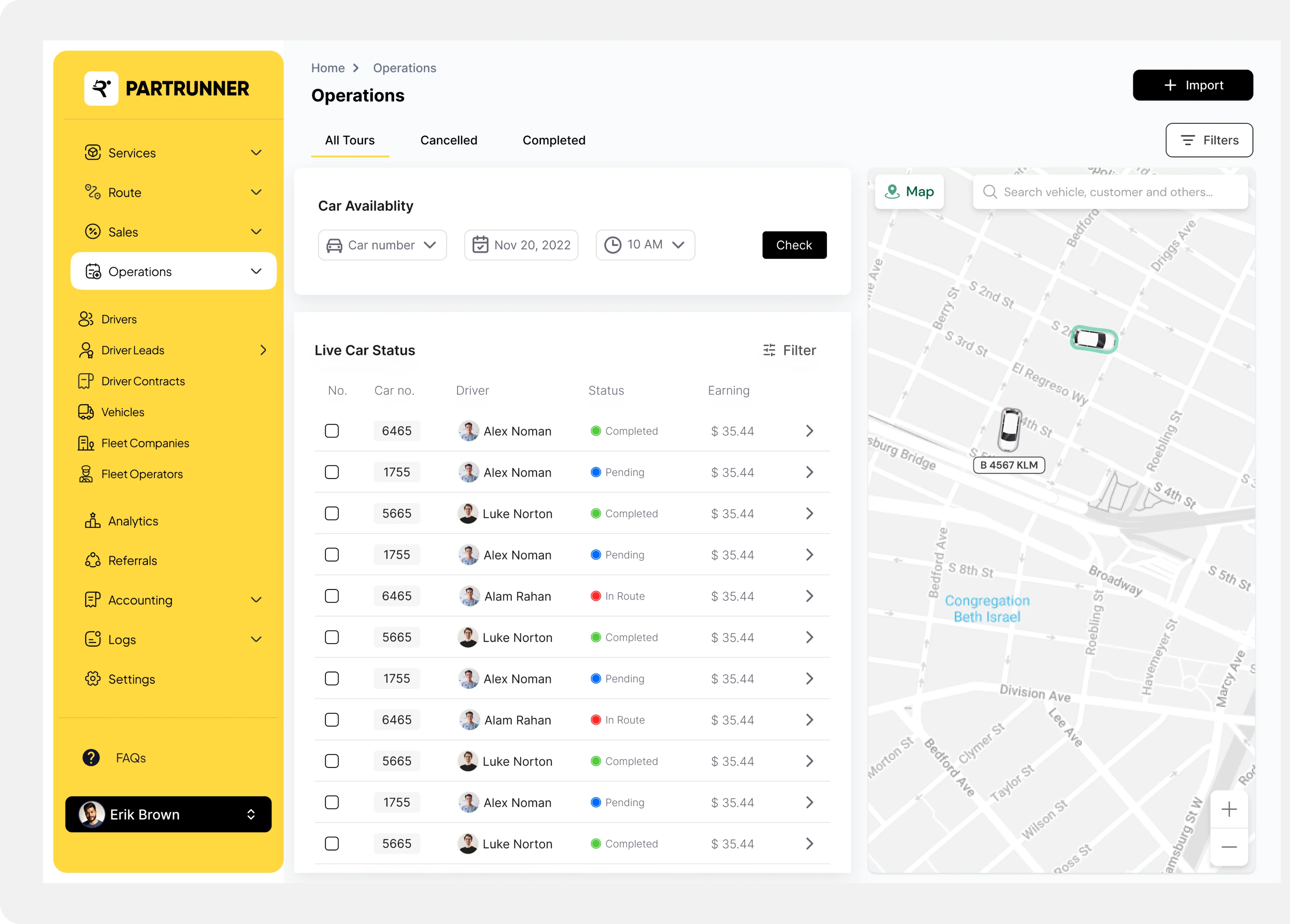
Interactive Dashboard with Delivery Tracking
- Our expert created an informative dashboard featuring detailed delivery information, a map view for real-time tracking, and route optimization tools.
- Improvements: Better delivery management, improved decision-making, and a more engaging user experience.

Standardized Information View with Filters and Tags
- Our designer introduced a standard layout for data displays, along with upfront filters and tagging options, making it easier for users to find relevant information quickly.
- Improvements: Faster data access, improved task efficiency, and enhanced user productivity.

Optimized Workflow and Information Architecture
- We reorganized the platform’s navigation by moving subtasks into their related main task pages, simplifying the workflow and reducing user confusion.
- Improvements: Enhanced usability, better user retention, and a more logical navigation structure.
The Impact
After implementing the UX improvements, we tracked several key metrics to measure the impact of our work:
35%
Decrease in task completion time
50%
increased feature adoption by utilizing key functionalities.
20%
Increased user satisfaction with user reporting ease of use.
40%
Improvement overall productivity.
“
The team at Kreeya did an excellent job. They took the time to thoroughly understand the requirements, asked clarifying questions as needed, and developed designs that exceeded expectations.
Overall, Kreeya is a great team to work with.
Tarun Aleti
Co-founder, CTO at Partrunner
%201.svg)

