

Your SaaS product can have the right features, strong demand, and enough signups to look healthy from the outside. But if users cannot understand the next step, complete routine work without friction, or trust the product inside their daily workflow, they will not stay.
Teams often blame pricing, missing features, weak customer success, or poor onboarding campaigns. Those factors do contribute to a high churn rate. But the deeper issue is often bad UX design.
According to PwC, 32% of customers would stop doing business with a brand they loved after one bad experience. So, if you don’t fix the UX issues, users will have a hard time navigating its features and can’t fully be dependable enough to become part of their daily lives. And hence, they’re most likely to switch to a better alternative.
This article explains how UX friction creates the conditions for SaaS churn, what signals to watch, and where to start fixing them. Let’s get into the details.
Why Churn Gets Blamed On Everything Except UX
Churn is easy to explain after it happens. A customer cancels, and the reason gets recorded as price, missing features, poor fit, low user understanding, or low engagement. Those reasons might be true, but they are often incomplete.
A user does not usually wake up one day and decide to leave a product that has been working well. Their problems would have started to appear much before they made the decision to leave. They struggle to finish setup, cannot find the feature they saw in the demo, ask support the same basic question twice, or stop logging in because the product does not fit naturally into the way they work.
Some customers churn out because they do not need the product (but that usually happens early on, or they have not found the value in the product). Others churn because they could not use it properly. Both are certainly a UX problem, the latter is even more dangerous.
In B2B or Enterprise SaaS, this is harder to catch because the buyer and user are often different people. The buyer may understand the product value, but the daily user may not reach it. When that happens, renewal becomes harder to defend even if the product seemed the perfect fit during the buying process. So, this changes how churn should be diagnosed.
Signals That Indicate User Churn
UX-driven churn usually shows up before the cancellation request. The challenge is that the signals are spread across product analytics, support, customer success, and sales notes. These are the patterns teams should look out for:
- Users log in less often after the first few sessions.
- New accounts do not complete the full onboarding.
- Admins invite fewer teammates than expected.
- Users frequently ask support how to complete basic tasks.
- High-value features remain unused.
- AI features get trial clicks but low repeat usage.
- Users export data from the product, then stop using the product itself.
- Only one person inside the customer’s team actively uses and promotes the product.
- Users search/Google outside the product for help
- Users do not spend much time on the product
- Users use other apps to do the same task
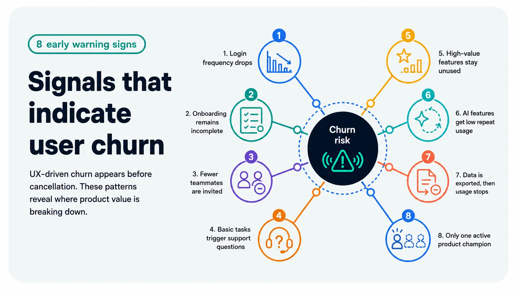
These are not just engagement problems, but rather product experience signals. If teams look at these systems separately, they often miss the pattern.
A SaaS account can look active from a billing view while the product is already losing relevance inside the team. The subscription may stay live for a few months, but the behavior tells a different story. That is why churn prevention should start with usage metrics and not only cancellation reasons.
Why Bad UX is More Expensive for SaaS Products
SaaS users have less patience for unclear products now because of their constantly rising expectations. They are used to better experiences, faster answers, guided workflows, intelligent defaults, and more granular control. They also have more options of competing products, which means they do not always wait for training or a customer success call when a product feels hard to use.
This does not mean every SaaS product needs to feel simple at the cost of depth. B2B and enterprise software will always have complex workflows. The real issue is whether that complexity is structured in a way users can understand, trust, and use the product daily without constant help. In fact, how far help lives is also a UX problem.
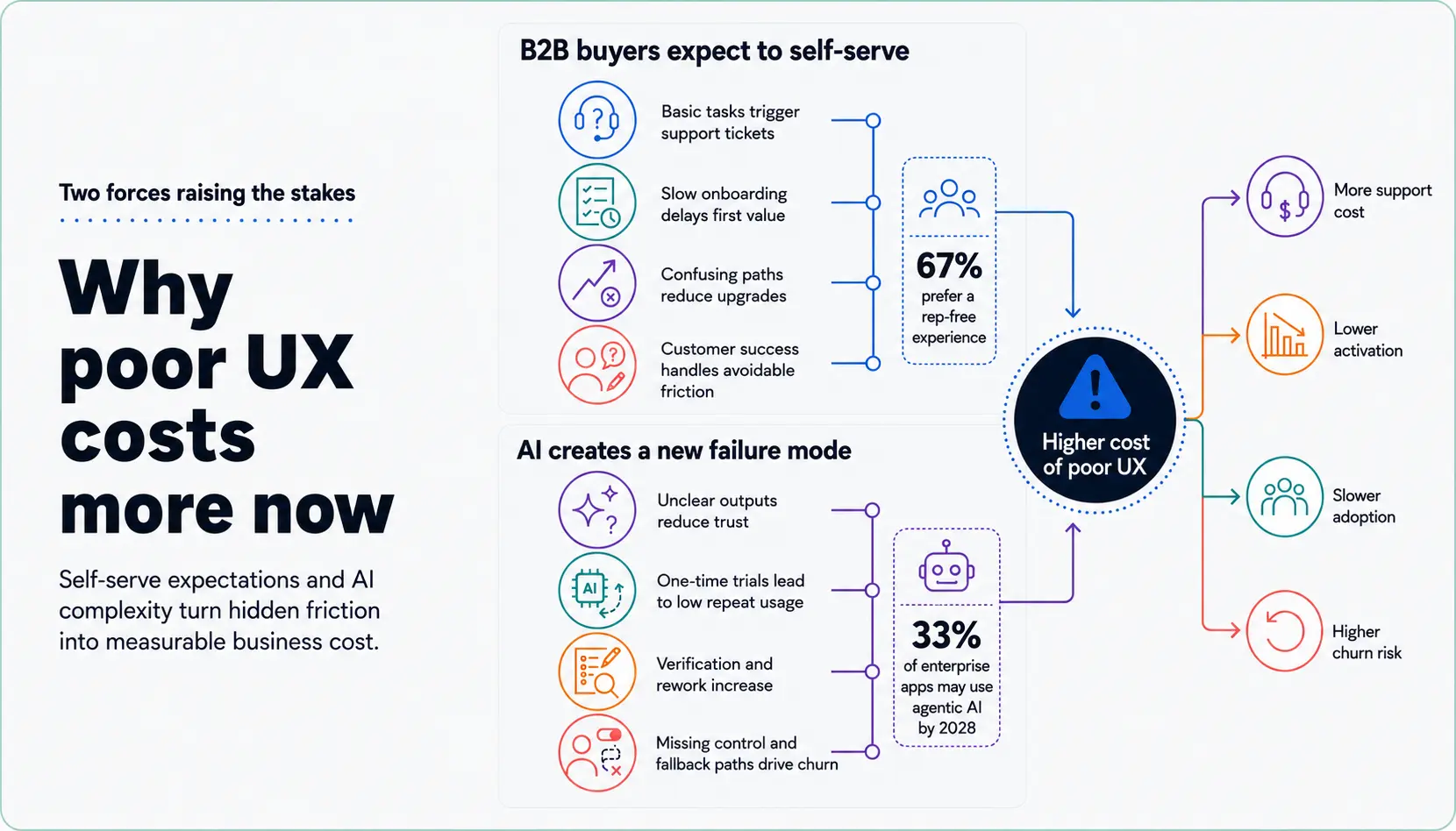
These are the 2 shifts that make poor SaaS UX more expensive.
B2B Buyers Expect to Self-serve
B2B buying is now more self directed. Gartner found that 67% of B2B buyers prefer a rep free experience. That expectation does not stop after purchase.
The same buyer who wants to evaluate software independently also expects the product to explain itself after signup. Onboarding, empty states, dashboards, help content, and upgrade paths now be designed in a way that users are accustomed to using other products. These all fall under usability heuristics. If users need to raise a customer support ticket to understand basic value, the product experience is already carrying too much hidden friction.
Customer success still matters. But it should help users solve complex problems, not as a solution for a product that is hard to understand.
AI Raised the Bar and Created a New Failure Mode
AI has changed what users expect from SaaS products. They now expect faster setup, smarter recommendations, automated summaries, and more personalized workflows. McKinsey’s State of AI 2025 shows that AI adoption is expanding across business functions, which means users are getting more familiar with AI assisted work.
But AI does not automatically improve UX. If users cannot understand, edit, verify, or override AI outputs, it’s a trust issue. An AI feature may look impressive in a demo but fail in daily use because users do not know why the system made a recommendation or what to do when the output is wrong.
Gartner predicts that by 2028, 33% of enterprise software applications will include agentic AI, up from less than 1% in 2024. That makes UX more important, not less. AI features need clear inputs, explainable outputs, review states, fallback paths, and user control.
Common Bad UX Design Problems That Increase SaaS Churn Rate
Bad UX design is not just limited to a few screens. It usually appears as repeated friction across onboarding, navigation, workflows, and trust moments. Each issue may look manageable on its own, but together they make the product harder to adopt and easier to abandon.
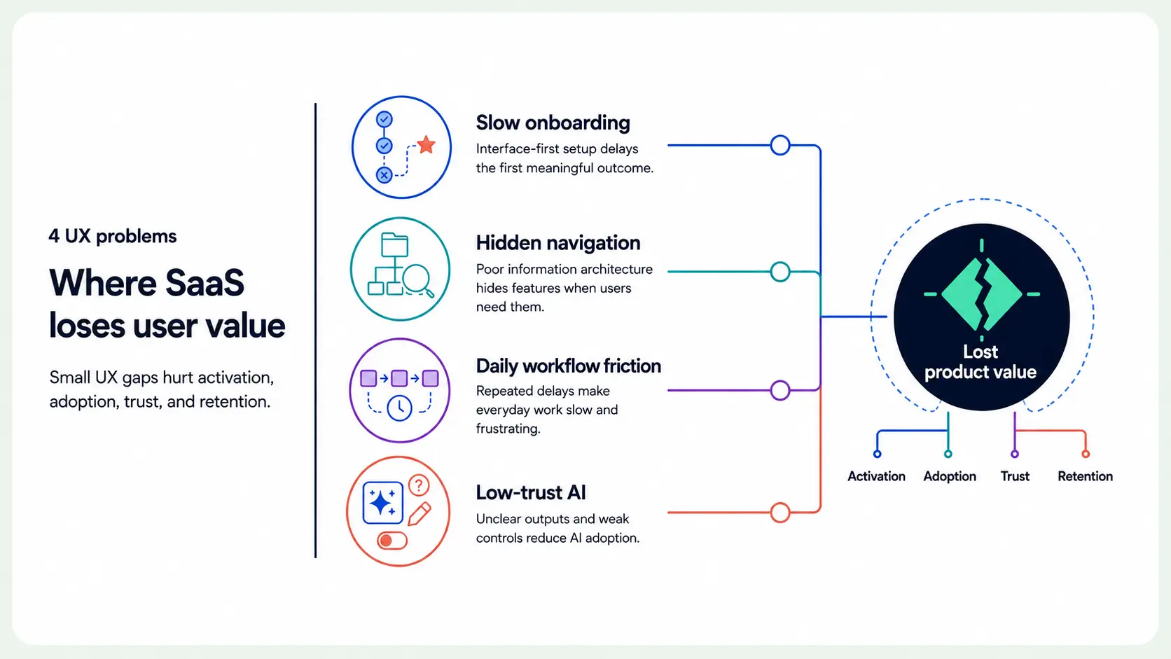
Following are the main UX problems most likely to increase SaaS churn.
Onboarding That Delays Time to Value
Onboarding fails the moment it ‘teaches’ the interface before helping users reach a useful outcome, instead of handholding the user to ‘understand’ how to navigate In a CRM workflow, such as HubSpot or Salesforce, a new user is not trying to complete profile fields for the sake of setup. They want to import contacts, create a pipeline, track deals, or see revenue opportunities more clearly.
If onboarding forces setup before showing progress toward that outcome, the user loses momentum. This is where many SaaS products create churn risk. They show product tours, checklists, and empty dashboards, but do not guide the user to the first meaningful result.
A better onboarding flow starts with the user’s role and goal. It handholds them as and when needed, and not all in one go. A sales manager, an SDR, and a founder should not be pushed through the same path if they need different outcomes.
Information Architecture That Makes Users Hunt for Value
As SaaS products grow, navigation often starts reflecting the company’s internal product structure instead of the user’s workflow. You see this in complex tools like Jira, Monday.com, or Asana. Teams need boards, automations, dashboards, templates, reporting, integrations, and permissions. Each feature adds power, but it also adds more places for users to search.
The problem is not that the product has too many capabilities. The problem is that users cannot always understand where those capabilities can be found and how they can be used. The product may already have the feature the user needs, but if the user cannot find it at the moment of need, it might as well not exist. That creates a value gap.
Clear information architecture helps users understand where they are, what matters now, and where to go next. Without it, feature depth is just a complex web of menu items.
Workflow Friction That Compounds Daily
Some UX issues look minor during a design review, but become painful when users repeat them every day. A report takes too many clicks to generate. A filter resets every time the page reloads. A bulk action only works on one item at a time. A permission error blocks progress without explaining what happened.
In support tools like Zendesk or Intercom, these small delays matter because agents repeat the same actions throughout the day. Tagging, assigning, escalating, replying, and finding customer context all need to feel fast and dependable. If those workflows feel like a drag, the product becomes slower than the work it is supposed to support.
That is why recurring workflows need special attention in SaaS UX. A flow that feels acceptable once may become one of the biggest reasons for churn when repeated every week.
AI Features That Erode Trust Instead of Building It
AI features fail when users cannot tell whether the output is safe to use. In an analytics product, an AI-generated insight is only useful if the user can understand where it came from. In a support product, an AI-drafted reply needs context, accuracy, and a layer of review. In an automation product, an AI agent needs to know its guardrails before it takes action.
Nielsen Group’s research on explainable AI points to the same issue. Users need explanations that help them understand AI outputs and decide whether to trust them. This is not only a technical problem. It is a product experience problem.
Trust is part of usability in AI SaaS.
Users need to know what the system did, why it did it, what data it used, and how they can correct the result. Without that control, AI becomes another reason users avoid the product.
How to Evaluate Where Churn is Happening Due to UX
Do not diagnose UX-driven churn only through cancellation surveys. Because there, users may describe the problem as price, lack of value, or poor fit. Those answers may be true, but they may not explain what caused the user to lose value in the first place.
Start by reviewing the behavior and product analysis:
- Which users activated and which users stalled?
- Where do new accounts drop before reaching value?
- Which features are used by recurring accounts but were ignored by churned accounts?
- Which types of users ask the most support questions?
- Which workflows create repeated friction?
- Which AI features get only first-time usage but no repeat usage?
- Which accounts need the most customer success support?
Then segment the answers by role, plan, company size, use case, and account type. An enterprise admin may churn because setup and permissions are too complex. A team user may disengage because the recurring workflow feels too laggy. A smaller account may leave because value was not visible in the first session.
A Few Practical Ways to Fix High Churn in SaaS Due to UX
Start with the workflows that are most important to retain value. Identify the 3 to 5 workflows that determine whether users keep getting value from the product.
For a CRM, that may include importing contacts, creating a pipeline, logging activity, and reviewing deal progress. For a support product, it may include triaging tickets, assigning ownership, replying with context, and escalating issues. For an analytics SaaS product, it may include connecting data, creating dashboards, sharing reports, and explaining insights.
Once those workflows are clear, improve them in this order:
- Remove unnecessary steps from repeat tasks.
- Improve empty states and default settings.
- Add role-based guidance where users stall.
- Make high-value features easier to discover.
- Reduce support dependency for routine actions.
- Add explainability, override, and review states for AI features.
Onboarding should also be redesigned around the first real outcome, not the first completed checklist. If the product uses AI, design it with the notion in mind that it assists the user but doesn’t completely eliminate the human review layer. Users should be able to inspect outputs, understand assumptions, edit results, undo actions, and decide when the AI should continue.
That is how good UX design starts to reduce churn rate in SaaS products.
How Kreeya Can Help
If you are facing a high SaaS churn rate the experience between the moment of signup and reaching the desired value is the most probable cause. And a UX audit can prove that.
At Kreeya, we help SaaS teams find the product friction that affects activation, adoption, retention, and growth. We review the flows users depend on, the places where they lose momentum, and the product decisions that make value harder to reach than it should be.
For AI-powered SaaS products, we also review prompt design, output clarity, trust signals, explainability, fallback states, and user control. These are now core parts of SaaS UX, not optional additions.
Contact us for advising on UX design strategy and design services for SaaS and enterprise products.
